Showing posts with label scrapbook layout. Show all posts

Tuesday, 28 August 2018

Home | Pink Paislee Auburn Lane | Agnus Kasprzak

Hi again :) I've got a scrapbook layout to share today using more beautiful items from Pink Paislee's Auburn Lane collection. 


I loved how this range worked in my project life album, which I shared here and here and thought that it would be perfect for a layout too.


This collection has lots of gorgeous rich tones and copper foil accents but I wanted to achieve a light and airy feel to my page, so I used the patterns sparingly in a series of layers built up beneath my photo which allowed me to use lots of different patterns without overwhelming the page.  I used mini thickers to create my title and framed it with one of the wood veneer frames from the collection to prevent it from getting lost on the page, and cut out a few mini houses from the paper range to reinforce my theme. 


To give the bottom half of my page which was prominently white a sense of depth, I added layers of distress inks using the 'ink smooshing' method which basically involves applying the ink to a slick surface (left over packaging) then spraying the ink with water before pressing it onto the page in a random manner. 


I like how the ink softened the stark white cardstock and helped to balance out the mustard and pink colours featured on the page. 


Products from the Sassy store...
Auburn Lane Die-cut Ephemera w/Copper Foil
Auburn Lane 6x8" Paper Pad w/Copper Foil
Auburn Lane Wood Veneer Frames 
Auburn Lane Cardstock Label Stickers w/Copper Foil
Auburn Lane Happy Life Mini Alpha Thickers
Auburn Lane 12x12 Cardstock - Paper No.1
Auburn Lane 12x12 Cardstock - Paper No.2
Auburn Lane 12x12 Cardstock - Paper No.11
Auburn Lane 12x12 Cardstock - Paper No.10
Auburn Lane 12x12 Cardstock - Paper No.6
Auburn Lane 12x12 Cardstock - Paper No.5
Auburn Lane 12x12 Cardstock - Paper No.8
Tim Holtz Distress Oxide Inkpad - Worn Lipstick
Tim Holtz Distress Inkpad - Fossilized Amber
Distress Stain Spray - Antiqued Bronze
Bazzill Classics Smooth White Cardstock 12x12 


Photobucket

Friday, 20 July 2018

Enjoy and Smile | Pinkfresh Studio Escape the Ordinary | Tarrah McLean

Hi Sassy Scrappers!

It's Tarrah McLean back with you and today I am sharing a new layout created using the awesome Escape the Ordinary collection by Pinkfresh Studio!

The inspiration for my layout today came about from my son's red jumper in the photo! Plus both my sons are going on a bushwalk so it was the perfect photo to team up with this collection! I flipped through the 6 x 6 paper pad and ripped out the red paper with all the quotes on it. I loved that I could cut them into strips and adhere them above and below my photo. 

As you can see I went with a fairly red theme on this page, pulling out lots of different bits and pieces that were red from the collection, like some of the cardstock stickers, puffy stickers, chipboard stickers and ephemera. I added some small touches of black and grey also to break up the red. 

I added a couple of embellishment clusters around the page including the one above with part of the layered, the Wild puffy sticker and the star and flower chipboard stickers. I love to cluster embellishments and I especially love to overlap embellishments onto my photo.  

Thanks so much for stopping by today! Be sure to check out the Sassy store for this collection and so many more craft goodies!

Happy creating!


Escape The Ordinary Single-Sided Paper Pack 6"X6" 32/Pkg    Escape The Ordinary Puffy Stickers 6"X8"
Escape The Ordinary Layered Tags 8/Pkg   Escape The Ordinary Fabric Die-Cuts 16/Pkg
Escape The Ordinary Ephemera Pack 63/Pkg   Escape The Ordinary Chipboard Stickers 5.5"X11"
Escape The Ordinary Cardstock Stickers 5"X7" 2/Pkg Phrases      Escape The Ordinary Cardstock Stickers 5"X7" Stitched Hearts
Photobucket

Wednesday, 14 March 2018

Unplug | Heidi Swapp Hawthorne | Agnus Kasprzak

Hi again :) I'm back with another layout using the gorgeous Heidi Swapp Hawthorne collection and have paired it with a fun assortment of mixed media items from the store.


If you like the look of mixed media products on your layouts but don't like the way they can warp and buckle your pages then the new mixed media Foundations cardstock from Vicki Boutin is definitely something to try. It comes in a pack of 12 heavy weight 140lb pages with a smooth surface that works well with various wet mediums, however this is paper so don't go crazy with the water ;)


I started by applying a thin coat of white gesso to my page then using a palette knife, I spread an even coat of gel medium through portions of my stencil to create some texture on the page. I chose to use gloss medium for this project because it creates a good resist and seems to absorb less colour... I also like the effect the sheen adds to some projects.


After removing the stencil, I sprinkled on a small amount of Magical Shaker powder over parts of the gel medium. The moisture in the gel will activate the powder and infuse the colour as it dries.
Don't forget to rinse your stencil immediately after use as the gel medium is quite hard to remove once dry - I learnt this the hard way!


Giving the gel medium plenty of time to dry,  I applied water on a brush over the stencilled areas to activate the colour in the magical powder. While these areas were still wet I used Scribble Sticks to lay down a colour base. I simple scribbled on some colour over the textured areas and let the pigment pool in the gaps - I used my brush to gently move the colours around and picked up any excess with a paper towel. Applying the pigment while the surface is wet is a good way to achieve a watercolour look and will eliminate any visible blending lines and concentrating on small areas at a time and overlapping onto each new area will give help to give your edges a nice natural finish.


I trimmed off about half and inch from two sides of my base and went around all the edges with a wet paint brush then skimmed the scribble sticks along the wet edge to create a subtle bleed of colour.


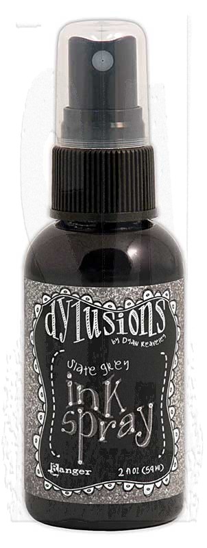
Once I had my base colours down, I applied some navy and grey spray inks to help tone down the colours and create a better match with the darker shades of the Hawthorne collection. I sprayed the inks onto some plastic packaging then flipped it over and pressed the colour onto areas of my background. I then used a blending sponge to apply some acrylic paints onto the surface, wiping away the excess with a baby wipe to reveal the stencilled areas.


Using a paintbrush, I applied some tacky glue to a few areas and attached some gold foil flakes to by background. You can read more about doing this in my previous post.


To finish the page, I mounted my photo onto several layers of patterned paper, and used the stickers from the collection along with one of the acetate words for my title. 


               Image result for dylusions ink slate grey      


09 10