Monday 29 June 2015

Project Life | Week 18...

Hello Sassy Friends! It's Leanne here again on this Project Life Monday and I am sharing another spread using the gorgeous Crate Paper Poolside, Pink Paislee Atlas & Amy Tangerine Rise & Shine collections.
 
Today is all about colour balance between photos, patterned papers and when I use black and white images to help share the story.
 
 
Oddly enough, I've taken multiple snapshots of flowers this week.  Well, I guess it's not that odd if you count my daughter having a recent birthday and Mother's Day being recorded in Week 18. 
 
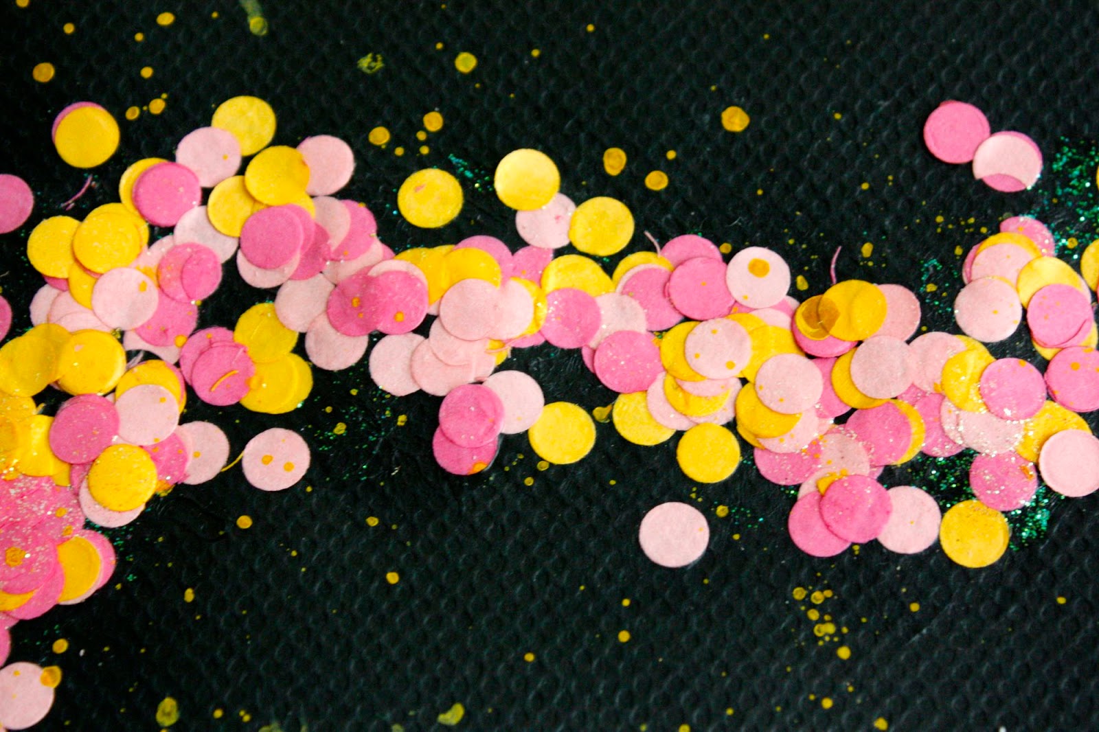
When it comes to colour selection for my patterned papers or PL cards, I always try to complement my photos.  Some weeks I am more lucky than not with the colours I've captured in my shots. Where there are dominant colours, such as the yellow and pink for this week, I will tend to use variations of the hues to continue throughout for cohesion.  With any garishly clashing photos, the obvious thing to do is convert them to black and white.
 
 
A second reason to use black and white photos is to soften the overall images.  Be mindful of where the black and white photos sit in your spread too.  On page one, I have created a visual triangle with them to please the eye. Placing all the black and white images together would create an unbalanced look on the spread. This visual link helps to draw the eye across the page.
 
 
For my weekly title card I have used pink and yellow flower patterned paper (Crate Paper Summertime), to highlight my flower bouquet photos. Flowers, as mentioned before, were a big deal during Week 18. Using a patterned paper to support this idea is just a subtle way to reinforce the importance.
 
 
Other touches of patterned paper hold spaces for journaling.  Small amounts of gold throughout the spread, also help link the pockets together visually.


 Black and white photos can also cover up a multitude of sins! Well, the sins of a blurry kind.  Most photos looks sharper if converted to black and white. If I don't have any other option, touching up my out of focus snapshot this way, makes for a bad photo to look okay.  Not everything has to be perfect though, so don't feel obligated to NOT use those blurry photos.
 
 
Page two is very photo heavy.
 

We had a lot to do this week and most of it was captured. One of the exciting things was the conclusion of my boys science experiment.  The life cycle of a butterfly. I used a collage photo  to represent the main stages of the caterpillar turning into a butterfly. Using a butterfly paper punch I created an embellishment for the story.


Sticker subtitles were added directly to photos as well.
 
 
My final tip when using black and white photos is to create mood. In the photo below, I used my iPhone to snap a silhouette style photo. We were at a parent/teacher interview and apart from not wanting to be obvious about taking a photo, I didn't want to capture other students and their identities in the shot. The mood here suggests foreboding! Ha! Especially for my son. *grin*
 

Thank you for visiting today. Don't forget to call into the Sassy shop for all your Project Life needs..x
 
Sassy Supplies:
 
Rise and Shine Chloe Paper 12x12 Fine and Dandy  - Fine and Dandy Specialty Gold Foil Paper 12x12 Poolside Cardstock Ephemera Die-Cuts 61/Pkg W/Gold Glitter Accent
Poolside Summertime Paper 12x12  Poolside Admit One  Paper 12x12  Elles Studio Woodgrain Alphabet
Rise and Shine Lily Paper 12x12 Becky Higgins Roller Date Stamp I AM Expressions Cardstock Stickers 12x12
Photobucket

Friday 26 June 2015

In to the blue

Hello Sassy Friends and happy Friday to you!

 One day my little Madam just decided to jump into my friend's pool, without her floaties. I stood by, spellbound at her courage and determination. The only fearful person there that day was me, terrified that it would all go wrong. Well didn't she prove me wrong. Now it's takes some serious persuasion to get my little fish out of the water!

As you may know, I recently taught at Escape2Create in Port Lincoln. One of the amazing teachers was Kim Price, who is very well known for her inspiring, ethereal backgrounds. My lucky classmates and I, were able to witness her technique firsthand, and I've used it on my page below, along with some Crate Poolside chipboard stickers.
I've seen some fantastic uses for these adorable Poolside mason jars (which come in white and woodgrain) I knew I wanted to use it upside down, and when I placed the chipboard swimmer near the opening of the jar, the rest of the page just fell into place beautifully.


I've kept the overall design simple purposefully, to maximise the impact of the background. The photo has been mounted onto paper, which opens to reveal my journalling. The whole bit tucks into the clear pocket on the jar.


To see more of Kim's amazing work, please head to her blog.


Thank you so much for taking the time to pop in today.

Have a fantastic weekend!
Chantalle
If you like this page, you can create your own with these elements from the Sassy store!
Poolside Chipboard Stickers 12"X12" W/Gold Accents
(Unfortunately out of stock at the moment)
Poolside Die-Cut Cardstock Window Pockets 6/Pkg Jar Shapes W/Gold Foil & Glitter AccentsPoolside Admit One  Paper 12x12 Hello Lovely - Sequins Pack Ranger Dylusions Vibrant Turquiose Ink Spray
 

Thursday 25 June 2015

hello today - Anita Bownds


Hi..everyone Anita here!!
This week I wanted to use the plus sign vellum from crate paper in a different way
On my layout using triangles 


I gathered some of the patterned paper and clear foiled card 
and stapled them together For my layers


And here is my finished layout
I've machine stitched the outer edge of the vellum and a border around the edge


I love the colours pink,gold, white and grey perfect for them girly projects
Gold word stickers are just super lovely 


I added the cute little star puffy stickers


I inked the wood veneer owl with light pink 
and added little hear puffy stickers for eyes


And a paper doily behind my photo as I'm really loving that look
And a flick of gold paint to finish it off

Products in the sassy store

Nine and Co Wood ShapesStudio Calico Seven Paper Amelia 6x6 Paper Pad
Studio Calico Seven Paper Baxter Puffy Stickers 71pcSeptember Skies Midnight Shadows Paper 12x12Poolside Gold Glitter Plus Signs + Vellium


Photobucket

Wednesday 24 June 2015

Fine and Dandy - She


Hi and welcome to my Wednesday post, Leonie here and I'm happy to share this page with our readers today.  
Featuring the Dear Lizzie 'Fine and Dandy' collection. 


I decided with this page to make a feature out of the tubes of confetti in this collection.  
I adhered them to the cardstock with matte medium.   I also painted a coat of medium over the top so the confetti will stay put!


Thanks for stopping by the Sassy blog, I hope you enjoyed my post today 
and are inspired to get creative.
Happy crafting.
 
Leonie Neal-Dawson.

Fine & Dandy Accent and Phrase StickersFine & Dandy Confetti and Glitter SticksFine and Dandy Bright Bows Paper 12x12Fine and Dandy Love Fest Paper 12x12Fine and Dandy Pretty Packages Paper 12x12
Photobucket
09 10