Monday, 30 April 2018

January Pocket Pages | Pinkfresh Studio | Agnus Kasprzak

Hi again :) So it turns out that January had a lot more photos than I thought it would, and even though my original plan for getting up to date fast was to create two double pages spreads per month, I have completed a third using more items from Pinkfresh Studio's A Case of the Blah's and The Mix No.2 collections. 


I'm still using the same format as my previous January pages and have used more of the same papers to keep the month consistent and when selecting products to use for the following month I always keep the colours in mind and look for similar tones so that each month flows nicely to the next without having to use the same products all year. 


I mentioned in my my previous post that not every photo needs to have a story attached and this is where a variety of die-cuts and stickers make quick work of filling in the gaps with text and colour. 


Using more die-cuts and stickers to create an easy filler card and being mindful of repeating the circle elements that I used to lead the eye across the pages in my my previous post and using the Silver Confetti transparency directly over a photo to give a rather plain picture a fun lift. 


I often use accents to join a vertical photo with a filler/journal card in the 6x4" pockets and have used this technique in several of my pockets.


There wasn't a lot of journaling to add on the next page as it is only documenting two days worth of photos, so I mainly relied on accents to set the overall tone of the page.  


Taking inspiration from the 'Meh' patterned paper to add some hand stitched detail to the negative space in my photos as a way to add some colour and interest to the pocket. 


Pairing a large die-cut with fun puffy stars and alpha stickers to help explain my dog's behaviour ;) 


I often crop my photos to include some negative space because I like to add accents to the pics, and always look for die-cuts and sticker that can be layered together to convey what is happening in the photo - this time also adding a little stamped sentiment

Products from the store... 

Friday, 27 April 2018

You Are Here | Simple Stories Travel Notes | Tarrah McLean

Happy Friday Sassy Scrappers!

It's Tarrah McLean back with you today sharing a new layout 

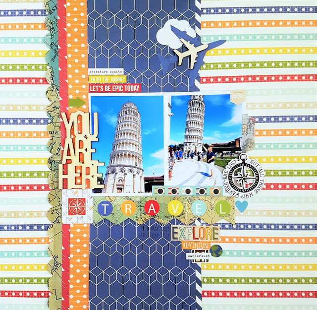
This week I wanted to use that super cool multi colour patterned paper as my background and then build my page from there. I am getting down to only a few bits and pieces left from this collection so it was a case of using up some paper scraps!

One thing I do have a fair bit left of are the stickers, I added quite a few to this layout to use them up, I used words and phrases that particularly go with my Leaning Tower of Pisa photos this week!
 
I just love that chipboard 'Travel' banner title and I was hoarding it until almost last! Before now, I just didn't find the right place for it on a page but because this week I have 2 photos it made it a lot easier to use it below my photos!

The 'You Are Here' wood veneer title is a perfect fit for this layout....my hubby and I loved being here in Pisa just wandering around and playing tourists! It is an epic place and the tower really does look as though it will fall over any day! 

Thank you so much for stopping by today!

Check out the Sassy store for the Travel Notes collection before its all gone!

Happy creating!


Travel Notes Bits & Pieces Die-Cuts 48/Pkg   Travel Notes Cardstock Stickers 12"X12" Combo
Travel Notes Chipboard Stickers 6"X12"  Travel Notes Double-Sided Cardstock 12"X12" - 3x4 Elements
Travel Notes Double-Sided Cardstock 12"X12" - 4x6 Horizontal Elements     Travel Notes Double-Sided Cardstock 12"X12" - 4x4 Elements
Travel Notes Double-Sided Cardstock 12"X12" -Travelogue    Travel Notes Double-Sided Cardstock 12"X12" - See The World
Travel Notes Stickers 4"X6" 8/Pkg     You Are Here Wood Veneer Shapes 27pk

Friday, 20 April 2018

Live Your Adventure | Simple Stories Travel Notes | Tarrah McLean

Happy Friday Sassy Scrappers!

It's Tarrah McLean back with you today to share another travel themed layout using the awesome Simple Stories Travel Notes collection!

I will be honest, when I first saw this map paper, I was a little intimidated by it! I knew I wanted to use it but I was stuck for ideas! I picked it up to use it but then put it down and keep doing that for a few days until I came up with the idea to handstitch a path from Australia to Europe! 

I had picked out this small photo to use when we visited Paris last year! It was my second time going but my hubby and boys had never been. We shared a special time in front of the Eiffel Tower as she lit up and sparkled late at night! It is so spectacular to see, so of course we caught it on camera!

 I kept the embellishing to a minimum so that it didn't detract from the background and I was really happy with how it turned out! The handstitching was done using 3 pieces of white embroidery cotton together. 

Thank you so much for stopping by today! Make sure to check out the Sassy Scrappers store for this collection and all the other amazing goodies in store!

Happy creating!

Tarrah x
Travel Notes Double-Sided Cardstock 12"X12" - See The World     Travel Notes Bits & Pieces Die-Cuts 48/Pkg
Travel Notes Cardstock Stickers 12"X12" Combo    Travel Notes Stickers 4"X6" 8/Pkg
You Are Here Wood Veneer Shapes 27pk

Tuesday, 17 April 2018

Pocket Pages | Pinkfresh Studio A Case of The Blah's | Agnus Kasprzak

Hi again :) I have been using the catch up plan from my previous post to continue working on our 2018 album and am happy to have another lot of January pages complete! I am using a mix of Pinkfresh Studio's A Case of the Blah's paired with some fun items from The Mix No.2 range and really like how these collections worked with all of my everyday photos.


Using a coordinating collection definitely helps your pages to flow but so does repetition! I added round elements to both my photos and cards to help lead the eye across each page. Printing my photos in batches has really helped me to speed up the process this month. 


My plan was to limit my printed journaling to simple journal strips, but some rules are worth breaking and I'm happy that I spent a little bit of extra time to create a printed background for a fun filler card. I printed the text onto some left over packaging from a sticker pack, and layered a sheet of transparency with a die-cut and one of the puffy stickers for a bit of dimension. 


Not all photos have a specific story attached to them, and that is where filler cards come into play and things can't get much easier than a fun mix of stickers and die-cuts with a little bit of hand stitched detail. 


The second part of the page should have been easier to create, however even the best made plans can falter when procrastination creeps in and I ended up spending quite a bit of time shuffling photos and cards around until I was happy with the final placement.. recognising the areas where you are spending too much time will help you to speed up the process the next time you are creating, so I am going to treat this as a learning moment instead of a time waster. 


My catch up plan relies on simplifying my process in order to get more pockets filled and using large die-cut saying makes the task of creating filler cards quick and easy, and the cute puffy star stickers were perfect for adding little pops of colour. 


Layered stickers are a fun way to add interest to simple journaling, and a single puffy sticker of censored characters was all that was needed to express how I felt when I broke one of my vases back in January ;) 


Products from the store... 
09 10