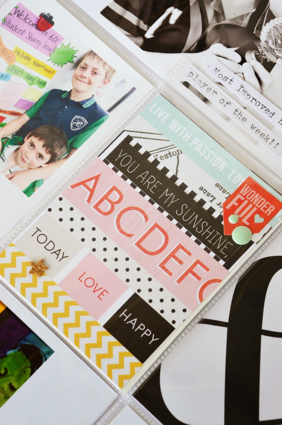
Linear lines were necessary this week, to bind the entire spread together. I had many photos to include and lots of titbits of journaling as well. My solution was to link the story directly to the photo with strips of typed text.
My page one started off simple enough. Photo collages and 4"x4" photos printed onto 4"x6" photo sheets were slipped into the top and bottom pockets. I also used four 3"x4" photos in the middle row, but because of the white space (literally) on the 4"x6" photos, I wanted the filler cards to be relatively simple (and clean) too.
The embellishments then sort of took on a life of their own. Once the journaling was added to the cards, I wanted to make a clear connection between them visually. This is where my linear lines started to evolve. In the photo above, you can see the three strips of embellishment text/phrase stickers. They help draw your eye across my pages and reminds the viewer that there are stories here among the multitudes of photos! *grin*
My title page also sports a few linear lines with the embellishment stickers lined up in bold strips to announce which week I am documenting. The colourful banner may not be entirely linear, but every now and then, I like to add a few surprises on my pages where the eye needs to stop and process what the difference is, before moving on.
On page two, the journaling strips are out in full force. There are no blocks of journaling used here, as repetition from the opposite page. These strip notes and embellishments however, continue to carry my idea over from the first page. Including the striped filler card shown above.
This week I also had the pleasure of entering my boys' classrooms for parent/teacher interviews. I wanted the images included in my Project Life to be similar. Not only because of the correlation between the two photos and the event, but I also wanted to include snippets of information relating to the boys and their classes, below the square cropped photos.
I've used another Simple Stories photo flip pocket to include the school photos around the filler card, trimmed from the Teresa Collins patterned paper, for the "ABC" print.
The remainder of my spread shares informal and daily details from our week. There are still hints of layers and linear lines found here as well.


Oh I am loving the simple and clean look Leanne!! Just gorgeous :)
ReplyDeleteYour PL just rocks!
ReplyDeleteThank you ladies...x
ReplyDelete