
Hi again, I'm back with another project life share using the awesome 'Family Fun' collection from Elle's Studio and have recently noticed a pattern emerging when I plan out my pages. No matter what your scrapping style is like, there is no doubt that our precious photos and memories are the main attraction in our project life albums but have you even considered the other factors that help to create a nice flow across each page in your albums? After giving this more thought I have narrowed it down to 3 main aspects... COLOUR. DESIGN. DETAIL.

Colour is usually the first thing that engages the viewer and really helps to set the tone for your projects. Colours don't always need to match but they generally need to compliment each other in some way for your pages to look visually appealing. Once the viewer has been drawn in by the colours, they will notice the design - does the page have a good design that helps to lead the eye across the page? Is there a sense of balance?


Scale is also something to consider when combing your patterned papers. Small delicate prints work well alongside larger bold patterns which is why I often buy both the 6x6" papers as well as a few 12x12" prints from the same range.

And just as importantly contrast also plays a big part in pattern pairing, for example busy colourful patterns generally work better alongside solid blocks of colour.

... just like these black spots on a white background work well with the white spots on a coloured background :) Check out my my previous post for more tips on combining patterns in split card designs and using simple things like white borders to help your colours pop against a bright background as well as mirroring and repetition to create a sense of balance.


Filler cards are a great way to add detail to your pages and they don't need to be elaborate. Simple things like a little bit of foam tape between two of the the pennant shapes and a toothpick was all that was needed to to create this fun layered flag.

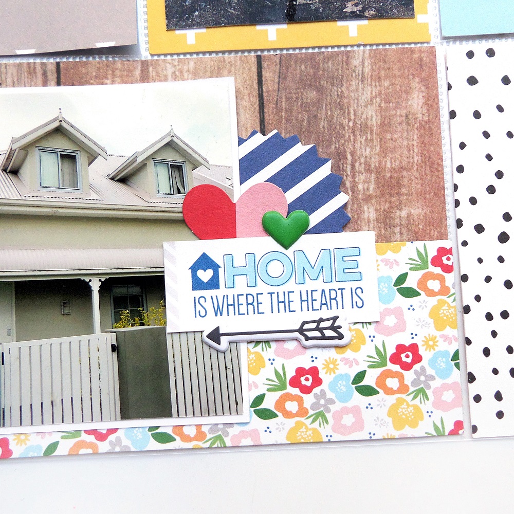
Add words and images directly over your photos and memorabilia to help them tie into your page.


Moving onto design, where simple things like scale can have a big impact on the sense of balance on your pages. Even though this particular photo has a lot of negative space where large embellishments could have been used, I already used quite a few larger accents in some of the other pockets and decided on a subtle pop of colour with a few fussy cut flowers from one of the patterns in the 6x6" paper stack.


... just like these black spots on a white background work well with the white spots on a coloured background :) Check out my my previous post for more tips on combining patterns in split card designs and using simple things like white borders to help your colours pop against a bright background as well as mirroring and repetition to create a sense of balance.

Only after your choice of colour and overall design has drawn the viewer in, will they notice all the little details that you have added - mind you this will usually happen in the blink of an eye so all the pretty details in the world can easily get overlooked if you haven't set the groundwork with the first two aspects.

Filler cards are a great way to add detail to your pages and they don't need to be elaborate. Simple things like a little bit of foam tape between two of the the pennant shapes and a toothpick was all that was needed to to create this fun layered flag.

Add words and images directly over your photos and memorabilia to help them tie into your page.

Use left over paper strips to create a layered base for your alpha stickers. Use a mix of die-cut words and alpha stickers to add more interest to your titles.

Mix textures to give your cards more depth and most importantly have fun with your designs!

Hopefully this COLUR. DESIGN. DETAIL. run down hasn't scared you off ;) and I hope that you find some of these tips useful when you are creating your next pages!
Products from the Sassy store...


No comments:
Post a Comment