Hi again :) Agnus here with another catch up post from my 2016 project life album. I am happy to have completed the final week of January, once again using the awesome Simple Stories 'Life in Color' collection from the store.
A lovely friend recently asked me "how do I get my photos to match the products I am using?" and it made me think about my process and realise that because I document each year on a weekly basis it is often hard to try and predict what sort of colours will appear in my photos, so instead of trying to plan my pages according to the pics, I will instead select a few key colours or patterns from my products that compliment several of the photos then repeat those colours across the pages to achieve a nice flow and allow you to pretty much make any range of products work in your albums.
For these pages, I repeated the grey wood grain pattern as well as the teal crosses across the entire spread. I also used a few pops of red as well as my 'go-to' combo of bold black and white to help tie it all together.
I am also mindful of which cards or accents are placed directly next to each photo and often spend a bit of time shuffling everything around until it all feels balanced.
I used various pieces from the Sn@p! Card pack as the foundation for this spread and loved that this collection includes a variety of textures and I was able to use a mix of paper and card stock stickers with chipboard and enamel to create more depth on these pages.
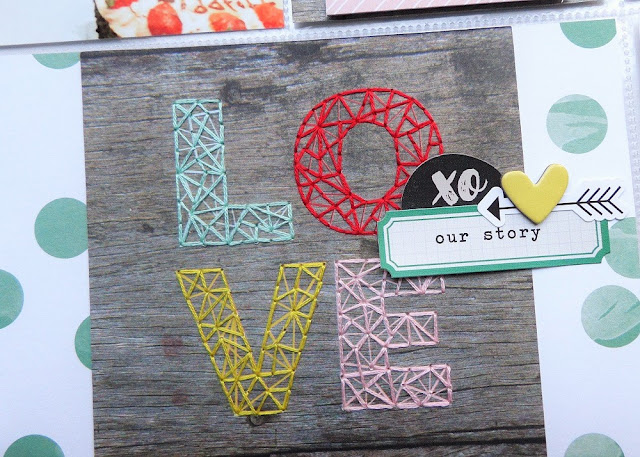
Stitching is always a good way to add some extra detail to your pockets, and the designs in this range were perfect for this.
I used a few simple paper and sticker layers to create a custom card for my journaling.
Simple Stories 'Life in Color' products from the store.


Love the stitching!
ReplyDelete